


Paint colors never behave quite the same in your living room as they do on the swatch. I’ve learned that morning sun can wash out warm neutrals, while that same Accessible Beige glows beautifully by lamplight.
Dim spaces crave intentionality. Deep warm taupe or soft gray create cozy depth where pale shades would feel flat and lifeless.
The trick is testing samples at every hour, watching how they shift and settle.
Light transforms everything it touches. Once you understand this dance between bulb and pigment, choosing becomes almost intuitive.
Paint chips lie. Not on purpose, but they absolutely do.
A color that looks perfect under store fluorescents can turn gray, green, or oddly yellow once it lands on your wall.
I painted my old living room a soft greige and spent three weeks convinced it had gone faintly purple every evening.
Light is the reason. Your windows, your bulbs, and the hour of the day all pull a color in different directions.
Refresh your space with Living Room Wall Color Ideas that create the right mood
Read the Light Before You Paint
Spend a day just noticing your room. Watch where the sun lands at nine in the morning, at two, and after the lamps come on.
North-facing rooms stay cool and a little flat, so warm colors keep them from feeling gloomy. South and west light runs golden and strong, which means cooler shades hold their shape better instead of going buttery by four o’clock.
Then buy samples and paint them big, at least two feet across, on more than one wall. Small swatches sit next to your old paint color and read wrong every time.
How Light Level Shapes Wall Color Performance

The amount of natural and artificial light in a living room fundamentally determines how wall colors appear and perform throughout the day. Rooms with abundant northern light require warm colors like soft yellows or warm grays, as cool tones appear dingy. South-facing spaces benefit from cooler hues, preventing overwhelming warmth.
Artificial lighting affects perception considerably: warm bulbs enhance cream and beige walls, while cool-toned fixtures suit blues and greens. Rooms with limited light need lighter shades to reflect available illumination. Testing paint samples on walls at different times reveals actual performance before commitment.
Warm Neutral Paint Colors for Low-Light Spaces

Warm neutral shades work particularly well in spaces with limited natural or artificial light, since they reflect available illumination while avoiding the flat, grayish appearance that cool tones can create. Beige, tan, and soft greige options enhance darker rooms effectively. These colors contain subtle yellow or red undertones, which brighten spaces without appearing overly saturated.
Popular choices include Benjamin Moore HC-82 Accessible Beige and Sherwin-Williams SW 7036 Accessible Beige. Warm neutrals pair well with adequate task lighting near seating areas, creating functional and balanced interiors. Testing samples on walls before committing guarantees proper color performance in specific lighting conditions.
Creamy Beige to Cozy Up Dark Corners

Many homeowners find that creamy beige shades effectively transform dim living room areas into warm, inviting spaces. Colors like ivory, sand, and pale taupe reflect available light while maintaining softness. These tones work particularly well in corners that receive minimal natural light.
Creamy beige pairs effectively with warm lighting fixtures, such as brass or gold lamps. The color creates a neutral backdrop for furniture and artwork without demanding visual attention. Unlike pure white, which can appear stark, creamy beige provides subtle warmth.
This approach makes darker corners feel larger and more accessible while maintaining overall room cohesion and balance.
Pale Yellow Paint for Brightening Dim Rooms
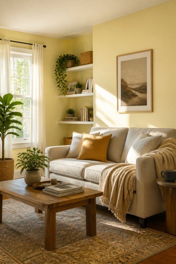
While creamy beige neutralizes dark spaces, pale yellow offers an alternative approach by actively introducing light into dim living rooms. Soft yellow shades, such as butter yellow or champagne yellow, reflect natural and artificial light effectively, brightening shadowy corners without overwhelming the space. This color choice works particularly well in rooms with limited windows or northern exposure.
Pale yellow pairs well with white trim and light wood furniture, creating a cohesive, luminous environment. The paint finish matters, matte finishes reduce glare, while satin finishes enhance light reflection. Applied strategically on accent walls or all surfaces, pale yellow transforms naturally dim areas into brighter, more inviting living spaces.
Warm Taupe for Flexibility Across Times of Day
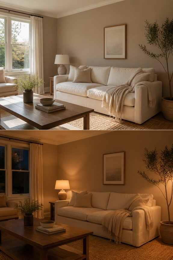
Taupe offers a different approach to brightening living rooms, functioning across morning light, afternoon brightness, and evening shadows without requiring strategic placement or finish selection. This neutral brown-gray tone maintains consistent appearance throughout the day, adapting to natural light shifts without dramatic color changes.
Taupe complements various furniture styles, from modern to traditional pieces, making it practical for diverse decor schemes. The color works well with both warm and cool accent colors, including blues, greens, oranges, and grays.
Homeowners benefit from taupe’s versatility, as it provides a stable backdrop that requires minimal adjustments based on time or season, reducing the need for supplementary lighting solutions.
Warm Linen for Textured, Organic Warmth

Linen-colored walls introduce a soft, muted beige with subtle texture that creates warmth without the boldness of saturated tones. This neutral shade works effectively across various lighting conditions, maintaining consistent appearance during morning, afternoon, and evening hours. The color pairs well with natural wood furniture, neutral textiles, and earth-toned accessories.
Linen walls reduce glare from bright sunlight while providing adequate brightness in dimly lit spaces. The organic quality suits both modern and traditional décor styles. Benjamin Moore HC-81 Accessible Beige and Sherwin-Williams SW 7036 Warm Stone exemplify this palette. The muted warmth encourages relaxation without demanding visual attention.
Warm Khaki for Casual, Inviting Atmospheres
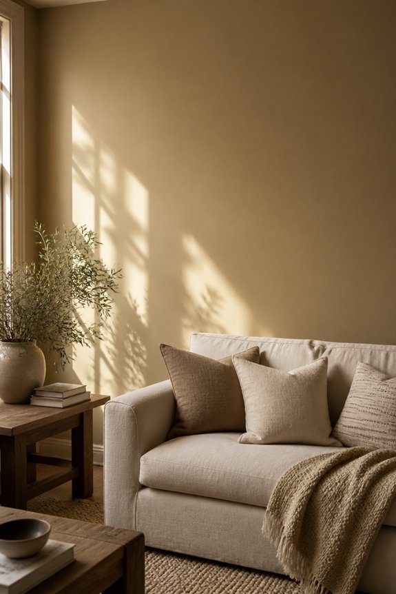
Because khaki tones sit between pure neutrals and deeper warm colors, they create approachable spaces that feel both comfortable and intentional. Warm khaki works well in living rooms with moderate natural light, as it reflects brightness without appearing washed out or sterile.
This color pairs effectively with cream furniture, wooden accents, and earth-toned textiles like linen or cotton. Khaki walls accommodate various décor styles, from traditional to contemporary designs. The shade encourages relaxation while maintaining visual interest through subtle depth.
Consider undertones when selecting: some khakis lean slightly green or yellow, affecting overall room atmosphere and compatibility with existing furnishings and lighting conditions.
Soft Blue-Gray for North-Facing Rooms

North-facing rooms present a particular lighting challenge, as they receive minimal direct sunlight and tend to appear cooler throughout the day. Soft blue-gray paint colors work well in these spaces, providing a balanced, neutral backdrop that doesn’t emphasize the cool tones already present.
Colors like Benjamin Moore’s Sea Salt or Sherwin-Williams’ Accessible Beige offer subtle warmth while maintaining sophistication. Blue-gray walls help counteract the dim lighting, making rooms feel brighter without appearing stark.
This color choice suits living rooms with limited natural light, creating an understated, professional environment. The soft tone accommodates various furniture styles and lighting fixtures effectively.
Cool Grays for Bright, Sun-Soaked Spaces
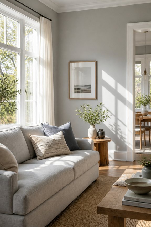
Bright, sun-soaked living rooms benefit from cool gray paint selections that balance abundant natural light without creating visual harshness. Colors like Sherwin-Williams Agreeable Gray and Benjamin Moore Marble Gray provide neutral backdrops that soften intense sunlight while maintaining brightness. Cool grays contain subtle blue or green undertones, which counteract warm light and prevent rooms from appearing washed out or yellow.
These shades work particularly well in spaces with south-facing or west-facing windows. The cooler pigments help regulate perceived temperature and create calm environments. Testing paint samples on different walls throughout the day guarantees the selected shade performs well during varying light conditions and times of year.
Charcoal Gray for High-Ceilinged, Bright Rooms
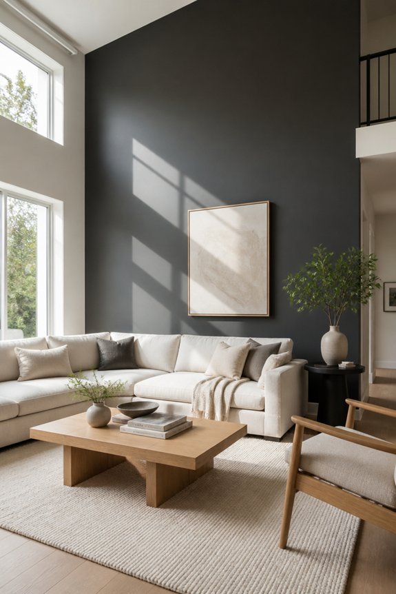
While charcoal gray might seem too dark for naturally bright rooms, it actually performs well in spaces with high ceilings and abundant natural light. The vertical space allows darkness to breathe, preventing the room from feeling cramped or cave-like. Large windows and skylights counterbalance the deep tone effectively.
Charcoal gray works particularly well in contemporary, industrial, and modern farmhouse styles. Paint samples on multiple walls reveal how light changes the color throughout the day. Pair charcoal walls with white trim, light wood furniture, and pale accessories to maintain balance and visual lightness in the overall space.
Butter Yellow for Naturally Lit Spaces

Butter yellow offers a different approach for sun-filled rooms, moving away from the darker tones that suit high-ceilinged spaces. This warm color works well in living areas with consistent natural light throughout the day. Butter yellow reflects sunlight effectively, brightening the entire room without appearing overly saturated or artificial.
The color pairs effectively with white trim, natural wood furniture, and neutral accessories. It suits traditional and contemporary design styles equally. Rooms with southern or western exposure benefit most from this shade, as it maintains visual balance despite intense afternoon light. Butter yellow creates an inviting atmosphere while remaining practical for various lighting conditions.
Cool Taupe for Sophisticated Styling

Cool taupe presents a neutral wall color that works in living rooms seeking an understated, refined appearance. This warm-gray shade complements both modern and traditional furniture styles, creating visual balance without demanding attention. Cool taupe pairs well with cream, white, and soft gray accents, establishing a cohesive palette.
The color performs effectively in spaces with moderate to ample natural light, where it reflects brightness while maintaining sophistication. Decorative elements like charcoal throw pillows, dark wood tables, and metallic accessories enhance the elegant aesthetic. Cool taupe serves as a versatile backdrop, allowing artwork and furnishings to become focal points rather than competing with wall surfaces.
Cool White-Gray for Minimalist Interiors

For minimalist interiors seeking simplicity and clarity, white-gray tones offer an ideal foundation that emphasizes open space and clean lines. These neutral hues work effectively with minimal furniture and décor, allowing essential pieces to stand out without visual competition.
Popular options include soft grays like accessible beige-gray blends and cooler undertones such as greige, which bridges white and gray seamlessly. White-gray walls complement natural light conditions consistently, whether rooms receive abundant sunlight or rely on artificial lighting.
This color palette pairs well with wood accents, metal fixtures, and concrete elements common in minimalist design. The result is an uncluttered environment promoting focus and calm.
Pale Slate for Modern, Grounded Rooms
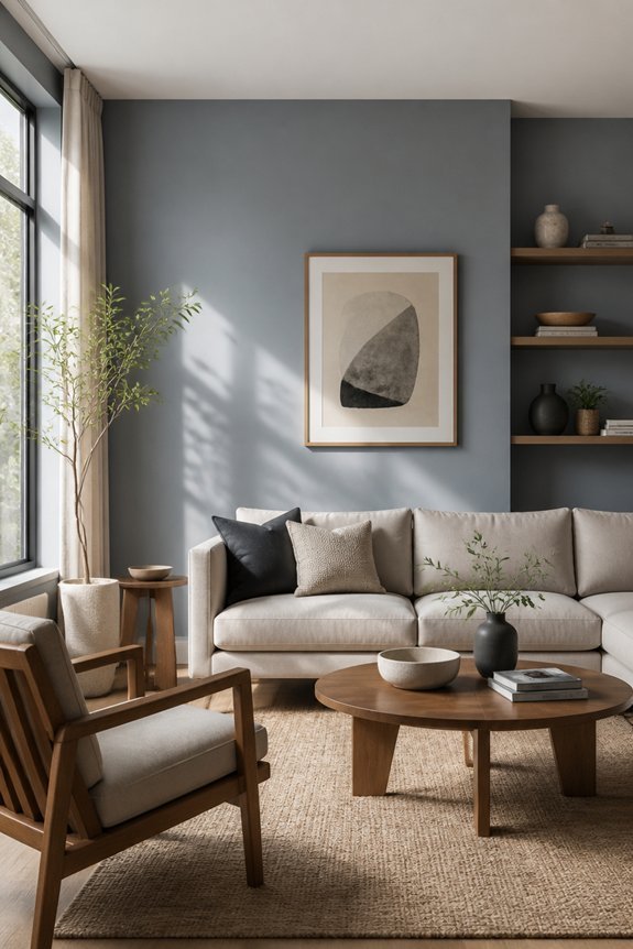
Pale slate serves as a sophisticated wall color for modern rooms that seek grounded, understated elegance. This muted blue-gray tone complements contemporary furniture, concrete accents, and minimalist décor styles effectively. The color works particularly well in spaces receiving moderate to abundant natural light, where it reflects brightness without appearing stark or clinical.
Pale slate pairs seamlessly with warm wood tones, stainless steel fixtures, and neutral textiles. It creates visual calm while maintaining visual interest through subtle depth. This shade suits open-concept living areas, as it establishes cohesion across adjoining spaces. The color remains neutral enough for various accent options, from deep charcoal accessories to soft cream furnishings.
Muted Terracotta for Warm, Ambient Light
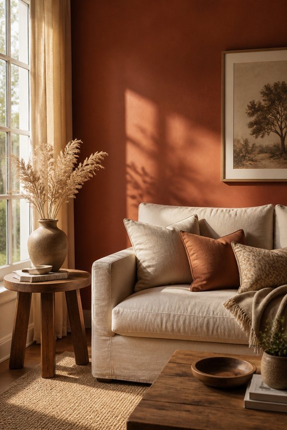
Muted terracotta offers a warmer alternative to cool-toned wall colors, bringing earthy sophistication to living spaces that benefit from soft, diffused light. This shade works well in rooms with north-facing windows, ambient lamps, or minimal natural sunlight.
Muted terracotta complements warm wood furniture, cream upholstery, and brass accents effectively. The color reduces harsh shadows while maintaining visual warmth without appearing overly saturated or bold. Rooms with this wall color feel intimate and grounded.
Paired with neutral trim and simple artwork, muted terracotta creates a balanced, calming environment suitable for relaxation.
Sage Green for Balanced, Medium Light
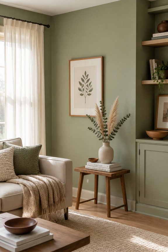
Sage green serves as an effective wall color for living rooms that receive moderate, consistent natural light from multiple directions. This soft, muted hue reflects light evenly without creating glare or dark shadows.
Sage pairs well with neutral furniture, wood tones, and white trim, maintaining visual balance throughout the space. The color works particularly in rooms with east or west-facing windows, where sunlight varies throughout the day.
Popular sage green brands include Benjamin Moore’s Healing Aloe and Sherwin-Williams’ Sea Salt. This versatile shade creates a calm environment while remaining practical for everyday living spaces without requiring excessive maintenance or frequent repainting.
Pale Sage for Calming, Balanced Rooms
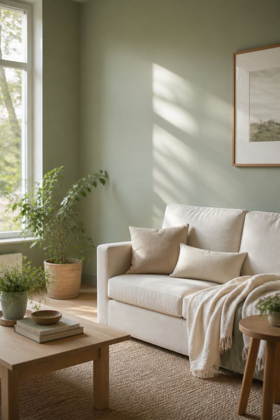
For rooms seeking an even softer approach than standard sage green, a paler version offers enhanced calming properties while maintaining the color’s balanced nature. Pale sage works well in spaces with moderate natural light, creating a serene backdrop without appearing washed out.
This shade pairs effectively with white trim, warm wood furniture, and neutral textiles. It suits bedrooms, bathrooms, and living areas where relaxation matters. The color absorbs light gently, reducing glare while maintaining visibility.
Pale sage complements both modern and traditional décor styles. Consider testing samples on multiple walls before committing, as lighting conditions affect how the color appears throughout the day.
Muted Olive for Calming, Nature-Inspired Spaces
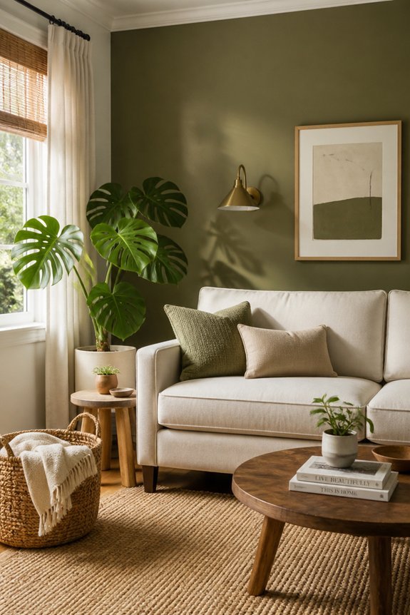
Olive tones draw inspiration directly from nature, offering a grounded aesthetic that complements living spaces seeking a calming, earthy atmosphere. Muted olive works particularly well in rooms receiving moderate natural light, where it appears soft and balanced rather than dark or overwhelming.
This color pairs effectively with natural wood furniture, linen textiles, and stone accents, reinforcing the nature-inspired theme. Specific shades like khaki-olive or grey-olive provide versatility across different décor styles.
The hue promotes relaxation without the sterility of neutral beiges, making it suitable for families prioritizing comfort and visual calm in their primary living areas.
Pale Celery Green for Fresh, Airy Feels

A lighter green shade that mimics fresh vegetables and spring growth, pale celery green creates an open, breathable atmosphere in living rooms. This color works particularly well in spaces with abundant natural light, as it reflects brightness without appearing washed out or sterile.
Pale celery green pairs effectively with white trim, light wood furniture, and neutral textiles like cream or soft gray. The shade suits modern and traditional design styles equally. In rooms with limited sunlight, this green may appear slightly muted, so layering with brighter accent pieces helps maintain visual interest and prevents the space from feeling dull or flat.
Pale Seafoam for Light, Breezy Rooms

Pale seafoam shifts the palette toward cooler, more aquatic tones, offering a distinctly different atmosphere from celery green’s earthy warmth. This muted blue-green works well in rooms with abundant natural light, as it reflects brightness without appearing stark. Seafoam pairs effectively with white trim, light wood furniture, and coastal-inspired décor.
The color creates a calming environment suitable for living spaces where relaxation is prioritized. In north-facing rooms, seafoam maintains visual warmth despite limited direct sunlight. Accent pieces in soft gray, cream, or pale blue complement the base color. This shade suits contemporary and traditional design schemes equally.
Soft Peach for Warm, Flattering Undertones
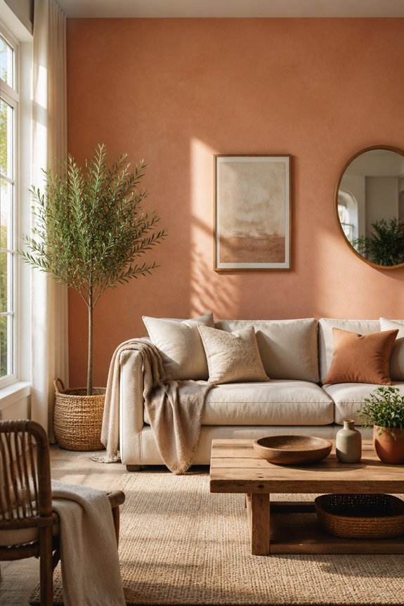
Soft peach introduces warm undertones to living room walls, creating an inviting atmosphere that flatters skin tones and complements various lighting conditions. This color works particularly well in rooms with natural light, as it enhances golden hour illumination.
Soft peach pairs effectively with neutral furniture, cream accents, and warm wood tones. It functions well in smaller spaces, appearing expansive without appearing cold. The shade suits both modern and traditional décor styles.
Consider Benjamin Moore’s Peach Parfait or Sherwin-Williams’ Sockeye for balanced warm undertones. Soft peach maintains its appeal throughout daylight hours, adapting to changing light without requiring additional wall treatments or accessories.
Blush Pink for Soft, Flattering Light
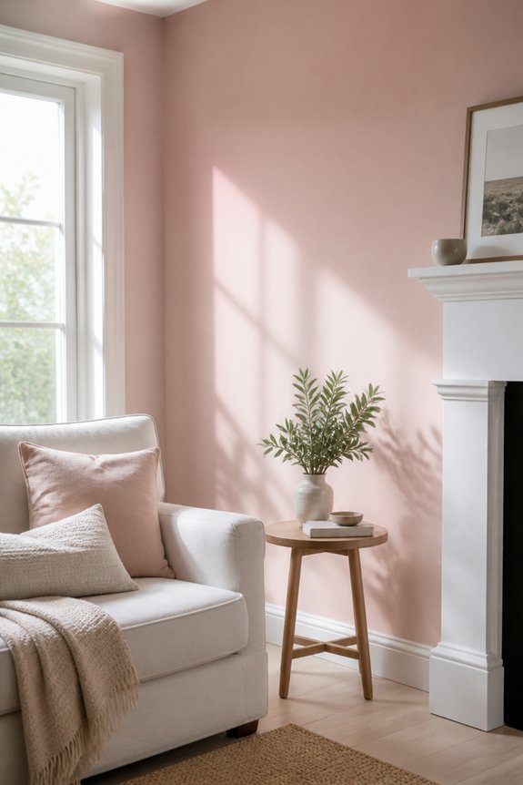
Blush pink delivers a gentle, diffused light quality to living room walls, creating an environment that softens harsh shadows and reduces visual strain. This pale, muted tone works particularly well in spaces receiving moderate natural light, as it reflects illumination without creating glare.
Blush pink pairs effectively with warm white trim, cream furnishings, and soft gray accents. The color suits various lighting conditions throughout the day, maintaining consistent appearance from morning through evening. It complements both modern and traditional décor styles.
Blush pink requires quality paint application to avoid streaking. Consider testing samples on large wall sections before committing to full coverage.
Pale Lavender for Unexpected Elegance
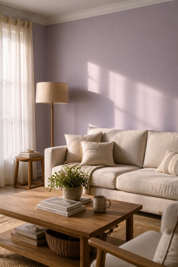
Lavender tones offer an alternative to warm pink hues, bringing subtle sophistication to living room spaces without sacrificing light reflection or visual comfort. Pale lavender works particularly well in rooms receiving moderate, filtered sunlight, as the color maintains visual clarity throughout the day.
This shade pairs effectively with neutral furniture, white trim, and light wood accents. Pale lavender also complements gray upholstery and soft furnishings. The color reduces visual harshness in bright spaces while preventing darkness in dimmer rooms.
Consider testing samples on multiple walls before committing, since lavender undertones vary between cool and warm versions, affecting overall room atmosphere considerably.
Muted Mauve to Inspire Creativity

Mauve serves as a bridge between purple and gray tones, creating an environment that supports focus and imaginative thinking in living room settings. This color works particularly well in rooms receiving moderate, indirect light.
Muted mauve pairs effectively with neutral furniture, cream-colored trim, and soft lighting fixtures. The shade reduces visual fatigue while maintaining visual interest throughout the space. Interior designers recommend this color for homeowners seeking a sophisticated atmosphere without the intensity of deeper purples.
Mauve creates a calm backdrop suitable for reading areas, creative work zones, and family gathering spaces. Paint samples should be tested under actual room lighting conditions before final application.
Soft Cream With Gray Undertones for Sophisticated Restraint
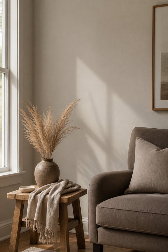
When a homeowner seeks a neutral wall color that conveys understated elegance, soft cream with gray undertones offers a practical choice for living rooms. This palette works well in spaces receiving moderate to bright natural light, where it maintains a balanced appearance without appearing overly warm or cold.
The gray undertones prevent the cream from looking dated or yellowed. Colors like Sherwin-Williams Accessible Beige or Benjamin Moore Cloud White exemplify this approach. The shade pairs effectively with dark furniture, light wood tones, and varied artwork. It accommodates multiple décor styles while maintaining visual restraint and sophistication throughout the space.
Soft Whites That Work in Any Room

Pure whites and near-whites offer an alternative to the gray-undertoned creams discussed above, providing a cleaner aesthetic that adapts across different lighting conditions and décor preferences. Whites like Benjamin Moore’s Simply White or Sherwin-Williams’ Alabaster serve as versatile backdrops for various furnishings and art styles.
These shades work effectively in rooms with limited natural light, as they reflect available illumination without appearing yellow or dingy. Soft whites maintain neutrality while supporting both modern and traditional design schemes. They require minimal maintenance and pair well with accent colors, making them practical choices for homeowners seeking straightforward wall solutions.
Soft Ivory for Timeless, Classic Elegance
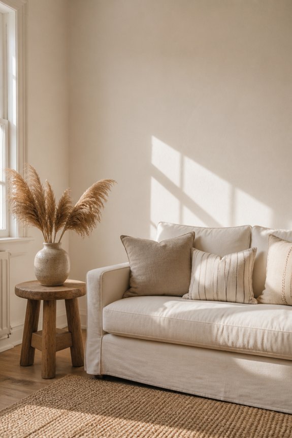
Ivory tones occupy a middle ground between pure whites and warmer creams, offering a subtle warmth that enhances traditional and transformative interiors. Sherwin-Williams Alabaster and Benjamin Moore Ivory White provide neutral backdrops that accommodate various décor styles, lighting conditions, and furnishing choices.
Ivory works effectively in rooms with north-facing windows, where cooler light might otherwise emphasize starkness. The color pairs well with natural wood furniture, dark baseboards, and accent walls in deeper tones.
Ivory maintains its classic appearance across seasons and design trends, reducing the likelihood of redecorating. This versatility makes ivory a practical selection for homeowners seeking enduring wall colors.
Pale Greige for the Ultimate Neutral Bridge

Greige represents a blend of gray and beige pigments, creating a color that bridges warm and cool undertones without committing fully to either direction. This neutral palette works effectively in living rooms with mixed lighting conditions, adapting subtly throughout the day.
Greige pairs well with both warm wood tones and cool metallic accents, offering design flexibility. Popular selections include Benjamin Moore’s Accessible Beige and Sherwin-Williams’ Urbane Bronze, though lighter variants exist for smaller spaces. The color requires adequate natural light to prevent appearing flat or dingy.
Greige functions as a sophisticated backdrop for artwork, furniture, and accessories without demanding attention itself.
Soft Greige-Blue for Transitional Spaces
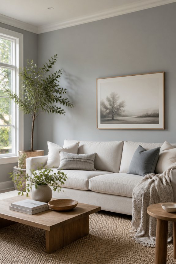
A whisper of blue mixed into greige creates a color that adapts between traditional and modern design styles. This soft greige-blue works well in rooms with mixed lighting conditions, since it shifts subtly throughout the day. In morning light, the blue undertones become more visible, while afternoon sun brings out warmer greige qualities.
This color suits homes evolving between aesthetic preferences, offering a neutral backdrop for varied furniture styles and decor. Brands like Sherwin-Williams Urbane Bronze and Benjamin Moore’s Healing Aloe exemplify this balanced palette. The shade performs effectively on accent walls, creating visual interest without overwhelming adjacent rooms or disrupting overall home flow.
Warm White With Golden Undertones for Added Warmth
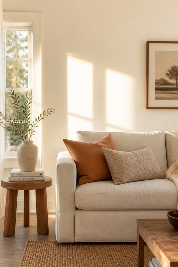
Warm white paint with golden undertones serves as a versatile base for living rooms seeking a welcoming atmosphere without bold color commitment. This shade works effectively in spaces with natural light, creating brightness while maintaining subtle warmth.
Popular options include Benjamin Moore’s Swiss Coffee, Sherwin-Williams’ Alabaster, and Behr’s Swiss Cream. Golden undertones enhance the coziness factor, making rooms feel more inviting than pure white alternatives. The color complements various décor styles, from modern to traditional furnishings.
Golden-undertone whites perform particularly well in rooms with afternoon sun exposure, as they reflect light while avoiding harsh, sterile appearances that standard whites can produce.
Warm Mushroom for Sophisticated Coziness
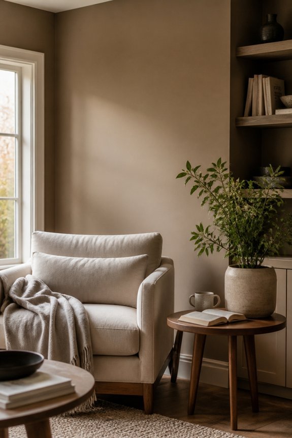
Mushroom tones, ranging from taupe to soft brown with gray undertones, create a refined backdrop for living spaces seeking understated elegance and comfort. These neutral hues work well in rooms with moderate to low natural light, as they avoid appearing dull or washed out.
Warm mushroom pairs effectively with natural wood furniture, cream-colored textiles, and muted accent colors like sage green or dusty blue. The color absorbs light gently, producing a cocoon-like atmosphere suitable for relaxation. Mushroom walls complement both traditional and contemporary décor styles.
Testing samples on large wall sections before committing guarantees the chosen shade matches the room’s specific lighting conditions and existing furnishings.
Pale Ochre for Earthy, Grounded Rooms
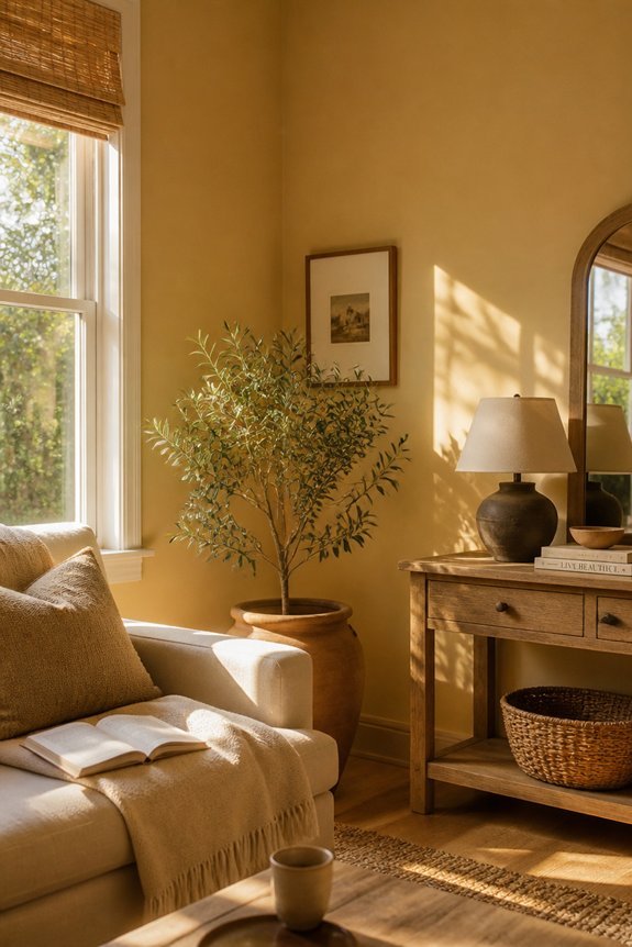
Ochre, an iron oxide pigment with warm yellow and brown undertones, provides living spaces with a grounded aesthetic that connects interiors to natural earth tones. Pale ochre works effectively in rooms receiving moderate to bright natural light, where it appears warm yet subdued.
The color pairs well with natural wood furniture, linen textiles, and clay pottery accessories. Pale ochre creates visual continuity between indoor and outdoor spaces, particularly in homes with garden views.
This shade suits various décor styles, from minimalist to rustic. It complements neutral accent colors like cream, taupe, and soft gray without competing for attention.
Warm Sand Tone for Desert and Warm Climates
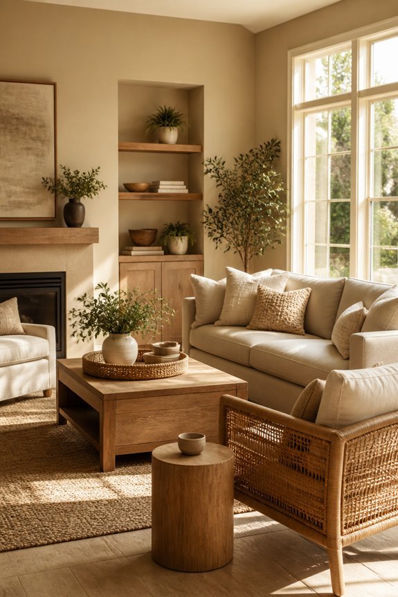
Sand-inspired wall colors, derived from desert landscapes and arid environments, offer living spaces a naturally warm aesthetic suited to hot climates. Warm sand tones, ranging from golden beige to light tan, reflect sunlight effectively, reducing heat absorption in rooms.
These colors complement natural materials like terracotta, adobe, and stone fixtures commonly found in southwestern or Mediterranean design schemes. Specific options include Benjamin Moore’s Swiss Coffee or Sherwin-Williams’ Accessible Beige, both providing neutral warmth without intensity.
Sand tones pair well with earth-toned furnishings, creating cohesive interiors. They work particularly effectively in rooms receiving substantial direct sunlight, as the lighter hue prevents spaces from appearing overly warm or dark.
Soft Dove Gray for Any Design Style

Soft dove gray represents a neutral wall color that adapts well to various interior design styles, from modern to traditional to eclectic schemes. This muted, cool-toned gray works with multiple color palettes, furniture types, and décor approaches. Dove gray pairs effectively with white trim, dark wood furniture, and brass accents.
The color maintains visual balance in rooms with abundant natural light or artificial lighting. Homeowners appreciate dove gray for its versatility across living spaces. It coordinates with navy blue, cream, warm metallics, and earth tones.
This shade requires consideration of undertones, as some formulations lean blue while others appear slightly warmer, affecting overall room appearance and aesthetic compatibility.
Muted Terracotta for Warm, Ambient Spaces
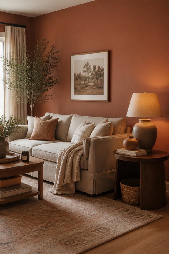
Muted terracotta offers homeowners a warm alternative to cool-toned neutrals like dove gray, introducing earthiness and visual warmth into living rooms without overwhelming the space. This color works well in rooms with moderate to abundant natural light, where it develops depth and richness throughout the day.
Terracotta pairs effectively with warm wood furniture, cream-colored accents, and natural fiber textiles like jute and linen. The shade complements both traditional and contemporary design styles.
In spaces with limited light, muted terracotta can appear darker, so testing samples on walls before committing remains essential for achieving desired results.
Frequently Asked Questions
How Do I Know Which Light Level My Living Room Actually Has?
One can assess a living room’s light level by observing natural sunlight throughout the day. A room receiving direct sun for most hours is bright; partial sun indicates medium light, while minimal sunlight suggests low light conditions.
Can I Use Dark Wall Colors in Rooms With Low Natural Light?
One can use dark wall colors in low-light rooms, though they require careful consideration. Dark hues may absorb available light, making spaces feel smaller or more confined. Strategic lighting solutions and reflective accents can mitigate these effects successfully.
How Do Paint Finish and Sheen Affect Color Appearance in Different Lighting?
Paint finish acts as a mirror reflecting light’s behavior differently. Matte finishes absorb light, making colors appear deeper and more subdued. Glossy sheens bounce light around, intensifying hue vibrancy. Semi-gloss finishes balance both effects, adapting color perception across varying lighting conditions throughout rooms.
What’s the Best Way to Test Paint Colors Before Committing to a Room?
One should purchase sample pots and paint large swatches directly onto walls, observing them throughout different times of day and lighting conditions. This method reveals how colors truly appear in the specific room environment before making a full commitment.
Should I Consider Artificial Lighting When Choosing Wall Colors for My Space?
Artificial lighting is absolutely essential, as it can make or break a room’s aesthetic. One should test paint samples under both natural and artificial light sources, since evening illumination considerably alters how colors appear on walls throughout the day.
Conclusion
Selecting wall colors requires understanding how light moves through a room. A homeowner painted her dim bedroom Accessible Beige, only to find it appeared gray at dusk. She tested samples at different times, then chose Warm Taupe instead. The color shifted beautifully from cream to soft brown throughout the day. This approach prevents costly mistakes, ensuring your chosen color performs well across varying light conditions and times.