Kitchen paint color selection requires understanding color theory, lighting conditions, and how pigments interact with kitchen materials and finishes. Warm undertones create inviting atmospheres while cool tones establish contemporary sophistication—selection depends on natural light availability, artificial lighting type, and desired emotional response. Paint finish selection matters equally: semi-gloss withstands moisture and cleaning better than matte finishes, while eggshell provides compromise between durability and aesthetic appeal.
Analyze your kitchen’s lighting carefully before selecting colors: north-facing kitchens benefit from warm yellows and creams brightening naturally dim spaces, while south-facing kitchens accommodate deeper tones without feeling cave-like. Artificial lighting temperature affects color perception significantly—warm incandescent lighting shifts cool tones warmer, while cool LED lighting exaggerates blue undertones. Test paint samples in actual lighting conditions observing changes throughout day before committing to full application.
Consider how kitchen paint coordinates with existing cabinetry, countertops, and flooring creating cohesive visual harmony. Neutral walls provide flexible backdrop allowing bold cabinetry to dominate, while colored walls require carefully coordinated complementary cabinet tones preventing visual discord. Understanding color relationships—complementary, analogous, triadic—ensures sophisticated results rather than clashing combinations. This analytical approach guarantees kitchen paint colors enhance rather than compete with existing design elements.
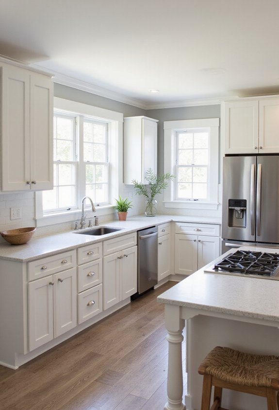
Soft White and Cream: Timeless Kitchen Elegance
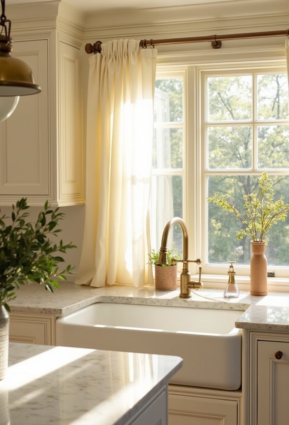
When you’re planning a kitchen renovation, soft whites and creams offer a versatile foundation that’ll work with nearly any design style. These neutral tones create an airy, spacious feel that makes your kitchen appear larger and more inviting.
You’ll appreciate how soft whites and creams complement both modern and traditional aesthetics. They pair beautifully with stainless steel appliances, natural wood cabinetry, and stone countertops. This palette allows your kitchen’s architectural features and décor elements to shine without visual competition.
You can enhance these base colors with strategic accents—consider adding depth through hardware finishes, backsplash tiles, or painted cabinetry. The lighting in your kitchen will influence how these colors appear throughout the day, so test samples before committing.
Soft whites and creams remain timeless choices that won’t feel dated in five years.
Also read: 10 Outdoor Kitchen Bar Ideas
Warm Greige: The Modern Neutral That Works
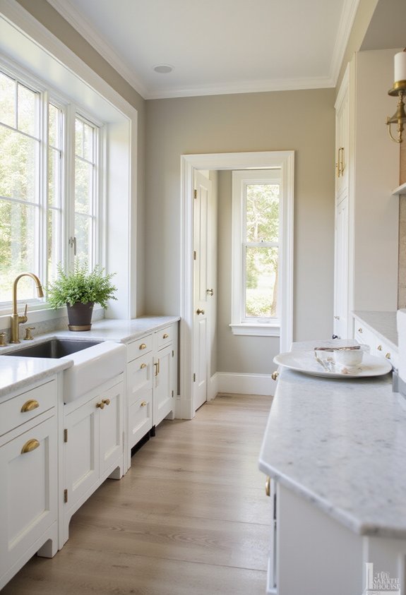
If you’re seeking a sophisticated alternative to pure whites and creams, warm greige delivers the perfect balance between gray and beige. This versatile shade adapts beautifully to various kitchen styles, from contemporary to farmhouse aesthetics.
Greige works exceptionally well with both cool and warm undertones in your cabinetry and countertops. You’ll find it complements stainless steel appliances while still pairing nicely with natural wood elements. The color creates visual warmth without feeling dated or overly trendy.
You can enhance greige’s appeal by layering different textures through your kitchen décor. Consider pairing it with brass or bronze hardware for added depth. Natural lighting affects how greige appears throughout your day, so you’ll appreciate how it shifts subtly between morning and evening hours, maintaining sophistication regardless of the time.
Sophisticated Navy for Kitchen Contrast
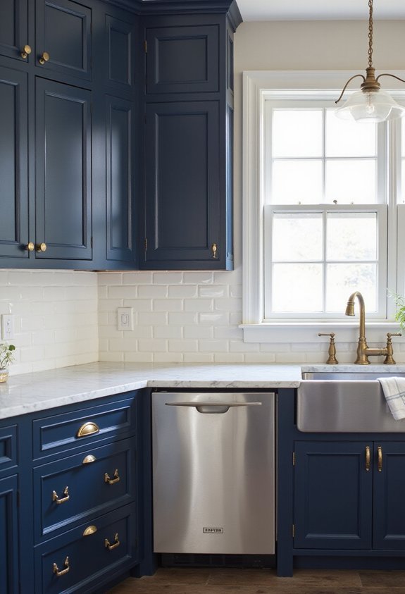
Navy offers a bold departure from neutral kitchen palettes, delivering dramatic contrast that anchors your space with timeless elegance. You’ll find that this deep blue transforms your kitchen into a sophisticated haven while maintaining versatility across design styles.
Navy pairs beautifully with white cabinetry, creating crisp, classic appeal. Alternatively, you can pair it with warm wood tones for a more inviting atmosphere. The color works exceptionally well on accent walls, drawing focus to architectural features or creating visual interest above your backsplash.
Consider your lighting carefully—navy absorbs light, so guarantee adequate illumination through windows or fixtures. This color complements both traditional and contemporary kitchens, making it a reliable choice for long-term satisfaction. You’ll appreciate how navy grounds your kitchen while maintaining the sophistication you’re seeking.
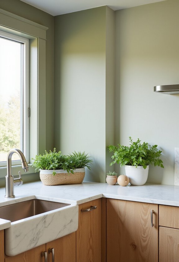
Sage Green: Create a Calming Space
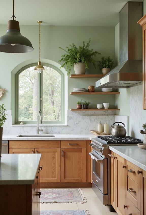
Sage green offers a softer alternative to navy’s bold drama, bringing natural serenity into your kitchen while maintaining sophisticated appeal. This muted, earthy tone creates a calming atmosphere that encourages relaxation during meal preparation and dining.
Sage green pairs beautifully with natural wood cabinetry, white subway tiles, and stainless steel appliances. You’ll find it complements both traditional and contemporary kitchen styles seamlessly. The color works exceptionally well with warm lighting, which enhances its organic qualities.
Consider using sage green on your main walls while keeping trim and ceilings neutral to prevent visual heaviness. You can also apply it to kitchen islands or accent walls for subtle impact. Pair it with warm metallics like brass or copper fixtures to enhance the welcoming, organic feel this versatile color delivers to your space.
Warm Gray: Versatile and Balanced
While sage green brings organic warmth, warm gray offers you a sophisticated foundation that adapts to virtually any kitchen style. This neutral shade complements both modern and traditional aesthetics without demanding attention.
Warm gray works exceptionally well with stainless steel appliances, white cabinetry, and natural wood accents. You’ll find it pairs seamlessly with various countertop materials and backsplash designs. Unlike cool grays that can feel sterile, warm gray includes subtle beige or taupe undertones, creating an inviting atmosphere.
The versatility extends to lighting conditions—warm gray maintains its appeal under both natural and artificial light. You can easily shift décor styles without repainting. This color provides a calming backdrop while allowing your kitchen’s architectural features and accessories to shine. It’s an investment in timeless sophistication that won’t feel dated in five years.
Pure White for Brightness and Clean Lines
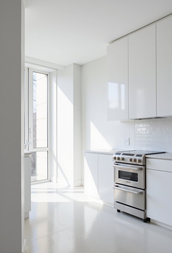
If you’re seeking maximum luminosity and visual clarity in your kitchen, pure white delivers unmatched brightness and crisp definition. This timeless choice reflects light throughout your space, making even modest kitchens feel expansive and airy.
White walls create sharp visual boundaries, allowing your cabinetry, countertops, and appliances to stand out distinctly. You’ll notice architectural details pop effortlessly without competing for attention.
The downside? Pure white requires diligent maintenance. Fingerprints, splatters, and dust become visible quickly, demanding regular cleaning. It can also feel sterile or cold without intentional design choices—incorporate warm-toned wood elements, stainless steel fixtures, or colorful accessories to inject personality.
Consider pure white if you prioritize brightness and don’t mind upkeep. Pair it with natural materials and accent colors to achieve a balanced, inviting kitchen that feels both clean and welcoming.
Soft Blue: Serene Cooking Environments
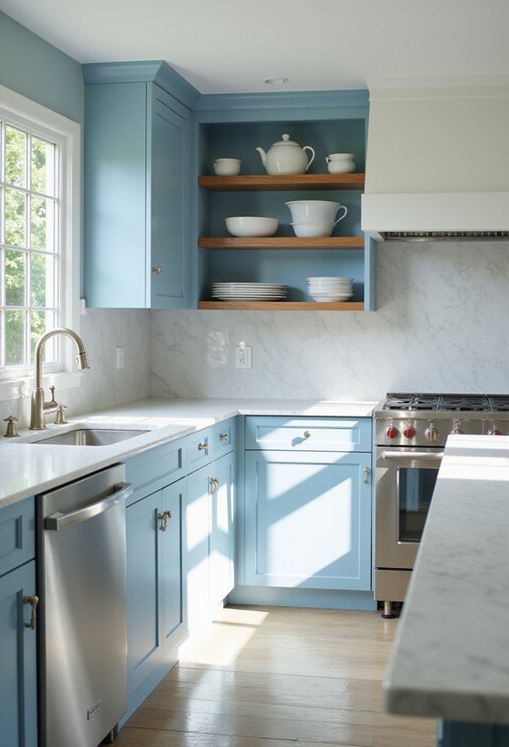
Soft blue transforms your kitchen into a calming retreat where you’ll naturally feel more relaxed while preparing meals. This serene hue reduces stress and creates a spa-like atmosphere that makes cooking more enjoyable.
You’ll find that soft blue pairs beautifully with white trim, stainless steel appliances, and natural wood accents. The color works particularly well on walls or cabinetry, instantly modernizing your space without overwhelming it.
Unlike stark whites, soft blue adds personality while maintaining cleanliness. It complements both contemporary and coastal design styles effortlessly. The versatility of soft blue means you’ll appreciate it for years without growing tired of the choice.
Consider testing samples in different lighting conditions before committing, as natural and artificial light affect how the color appears throughout your day.
Warm Taupe: Subtle, Sophisticated Warmth
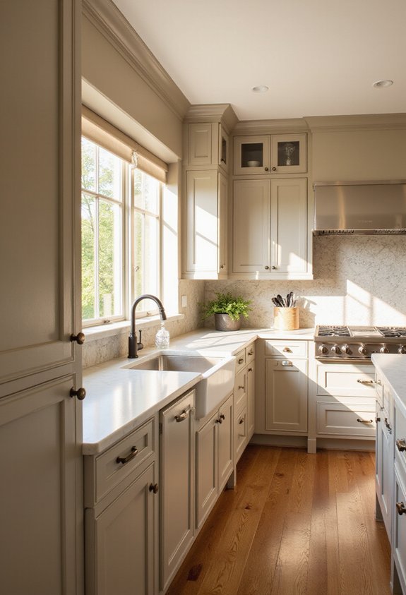
Warm taupe brings together the understated elegance of neutral tones with a welcoming warmth that’ll elevate your kitchen’s sophistication. This versatile shade works beautifully with both modern and traditional designs, adapting seamlessly to your existing décor.
You’ll find that warm taupe complements stainless steel appliances, natural wood cabinetry, and stone countertops exceptionally well. It creates a calming backdrop without feeling bland or cold, making your cooking space feel inviting and refined simultaneously.
The color’s subtle warmth encourages relaxation while maintaining a clean, organized aesthetic. Pair it with brass or gold hardware accents to enhance its sophisticated nature. Natural lighting will highlight taupe’s depth throughout the day, revealing different tones as sunlight shifts across your walls, creating visual interest without demanding attention.
Muted Olive: Bring Nature Indoors
Muted olive brings the tranquility of nature into your kitchen while maintaining the sophistication of a curated space. This earthy tone works beautifully with natural wood cabinetry, stainless steel appliances, and marble countertops. You’ll find that muted olive pairs exceptionally well with warm lighting, which enhances its depth without appearing heavy.
Consider using this shade on an accent wall behind open shelving to showcase your dishware collection. Pair it with white trim and soft brass hardware for a modern farmhouse aesthetic. If you prefer a bolder approach, paint all walls this calming hue to create an immersive, nature-inspired environment.
Muted olive won’t compete with colorful kitchen accessories or artwork. Instead, it’ll serve as a grounding backdrop that encourages relaxation and creativity while you cook and gather with loved ones.
Charcoal Gray: Go Bold and Modern
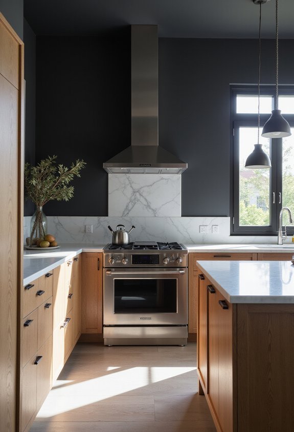
If you’re ready to make a striking statement, charcoal gray delivers the modern sophistication you’re seeking. This deep, neutral tone creates a sleek backdrop that complements contemporary kitchens beautifully.
Charcoal gray pairs exceptionally well with stainless steel appliances and minimalist cabinetry, amplifying your space’s modern aesthetic. You’ll find it works equally well with natural wood accents, adding warmth to the boldness. The color absorbs light subtly, creating depth without feeling oppressive when you balance it with bright countertops or backsplashes.
This versatile shade hides imperfections better than lighter colors, making maintenance easier. You can dress up charcoal gray with metallic hardware or tone it down with matte finishes. Consider testing large swatches before committing—charcoal gray’s intensity transforms dramatically depending on your kitchen’s natural and artificial lighting conditions.
Pale Yellow: Energize Your Mornings
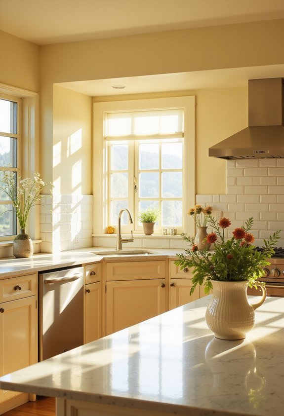
Pale yellow breathes life into your kitchen with its cheerful, energizing presence. This soft hue creates an inviting atmosphere that brightens your mornings and makes cooking more enjoyable. Unlike bold yellows that can overwhelm, pale yellow offers subtlety and sophistication while maintaining its uplifting qualities.
You’ll find this color works beautifully with white cabinetry, stainless steel appliances, and natural wood accents. The shade complements both modern and traditional kitchen styles seamlessly. Pale yellow also reflects light effectively, making smaller kitchens feel more spacious and airy.
Consider pairing it with warm metallic fixtures or soft neutrals to enhance its warmth. This versatile color pairs well with various countertop materials and flooring options. You’ll appreciate how pale yellow energizes your space without demanding attention.
Soft Blush: Contemporary Kitchen Softness
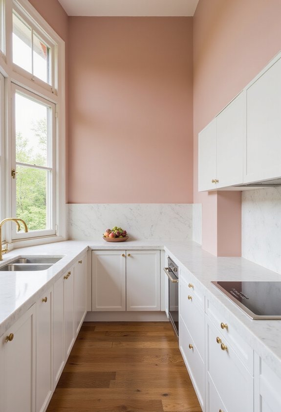
As a modern alternative to stark whites and bold primaries, soft blush brings warmth and sophistication to your kitchen. This delicate pink tone works beautifully with contemporary design elements, creating an inviting yet refined atmosphere.
Soft blush pairs exceptionally well with stainless steel appliances, marble countertops, and minimalist cabinetry. You’ll find it complements natural wood accents and metallic hardware, adding depth without overwhelming the space.
The color promotes a calming environment while maintaining visual interest. It reflects light softly, making your kitchen feel airier and more spacious. Unlike trending pastels that fade quickly, soft blush offers timeless appeal that won’t feel dated.
You can apply it to all walls for an immersive look or use it as an accent wall to define your kitchen’s character. Either approach delivers contemporary sophistication.
Black Accent Walls: Make a Design Statement
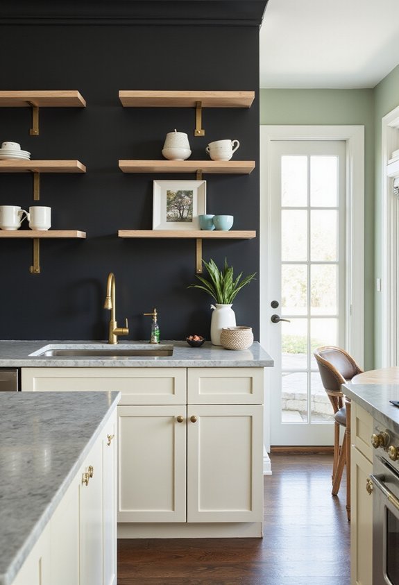
While soft blush whispers sophistication, black accent walls command attention and create dramatic visual impact. You’ll transform your kitchen into a bold, contemporary space that exudes confidence and style.
Black works exceptionally well as a feature wall behind open shelving, where it showcases your dishware and décor beautifully. You can also paint your kitchen island or lower cabinetry black for a grounded, modern aesthetic.
The key to success is balancing black with lighter elements. Pair it with white countertops, stainless steel appliances, or natural wood tones to prevent your kitchen from feeling too dark or oppressive. Strategic lighting amplifies the elegance—consider installing pendant lights or under-cabinet illumination.
This bold choice signals that you’re willing to take design risks and create a space that’s unmistakably yours.
Frequently Asked Questions
How Do I Choose Between Matte, Satin, and Gloss Finishes for Kitchen Paint?
You’ll want to deliberate durability and maintenance for your kitchen. Choose gloss for high-moisture areas like backsplashes—it’s simplest to clean. Pick satin for walls; it resists stains while obscuring imperfections. Use matte sparingly since it’s more challenging to wipe down.
What’s the Best Primer to Use Before Painting Kitchen Walls?
You’ll want to use a high-quality kitchen primer that’s specifically formulated to resist moisture and stains. Look for primers labeled “kitchen and bath” or “stain-blocking.” They’ll protect your walls from grease splatters and humidity better than standard primers.
How Often Should I Repaint My Kitchen Walls for Durability?
You should repaint your kitchen walls every 3-5 years for ideal durability. However, you’ll extend this timeline by using quality primer and paint, maintaining proper ventilation, and promptly addressing any moisture issues or damage you notice.
Can I Paint Kitchen Cabinets the Same Color as My Walls?
Yes, you can paint your kitchen cabinets the same color as your walls. You’ll create a cohesive, seamless look throughout your space. However, you should use cabinet-specific paint formulas for better durability and wear resistance on high-traffic surfaces.
Which Paint Brands Are Most Resistant to Kitchen Moisture and Stains?
You’ll find that Sherwin-Williams, Benjamin Moore, and Behr offer excellent moisture-resistant formulas. You should choose their semi-gloss or satin finishes, which you’ll find provide superior stain resistance and durability in kitchens.
Conclusion
You’ll transform your kitchen into a space that truly reflects who you are by selecting from these versatile paint colors. Whether you’re drawn to timeless neutrals or bold statement hues, you’ve got options that work with any design style. The right color choice will energize your mornings, calm your evenings, and create an inviting atmosphere where you’ll love spending time. Pick the shade that speaks to you and watch your kitchen come alive.
