

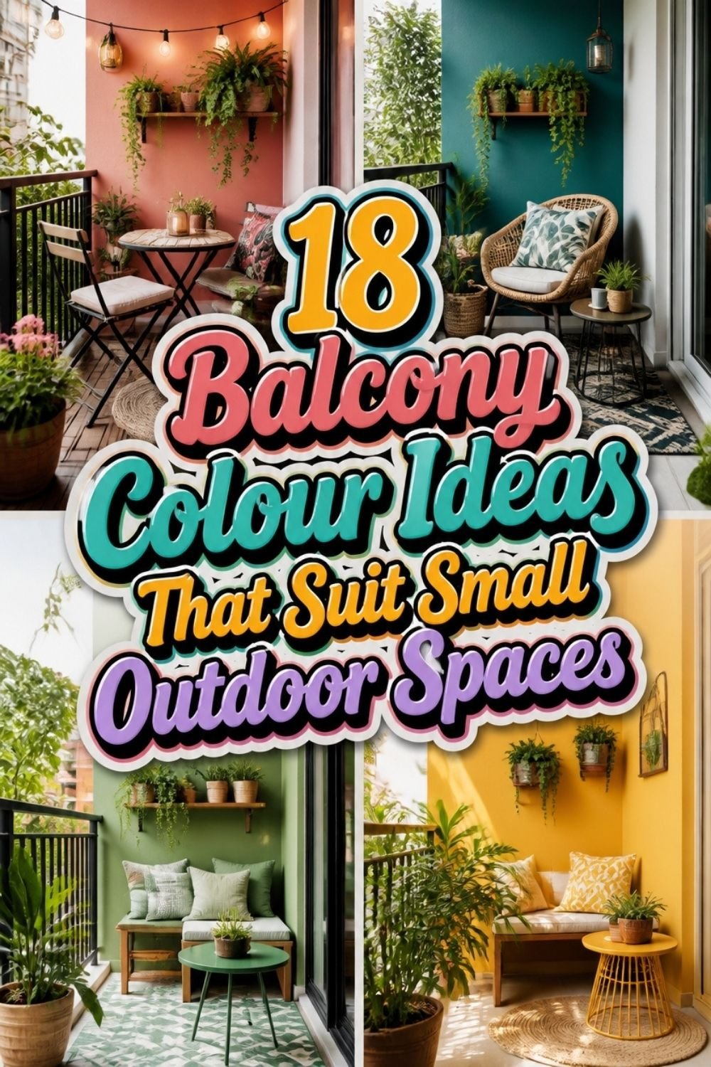
My balcony is barely wider than my arm span. For two summers I ignored it completely.
What finally changed things was colour, not more furniture and not clever storage.
Most balcony colour ideas come down to one principle: pale surfaces make the space breathe, and a single warm accent gives it somewhere to land.
Small spaces are honest. Every shade you choose shows up loudly.
Pick well and six square feet can feel like a room you actually want to sit in.
Before You Commit to a Colour
Look at your balcony at the hour you actually use it. A west-facing spot that only sees you at six in the evening needs different colours than one you sit on with coffee at seven in the morning.
Then decide what stays neutral. Walls, flooring, and railings cover the most surface, so keeping those light gives everything else room to breathe. Save your bolder colour for cushions, planters, and one small piece you can swap out later.
Buy the outdoor formula, not the leftover tin from your hallway. Balcony surfaces take sun, rain, and temperature swings, and interior paint will start peeling by the second season.
Soft Whites and Creams for Small Balconies
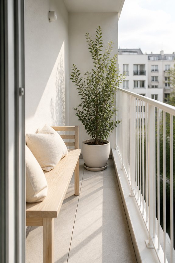
Soft whites and creams function as practical color choices for small balconies, creating an appearance of increased space through their light-reflective properties. These neutral tones work well with various materials, including wood railings, metal frames, and concrete surfaces.
Soft whites visually expand limited square footage, while creams add subtle warmth without overwhelming the area. Furniture and accessories in coordinating shades maintain visual continuity. Paint finishes like eggshell or satin provide durability and easy maintenance.
Planters, cushions, and outdoor rugs in matching or complementary neutrals enhance cohesion. These colors also reduce heat absorption, keeping balconies cooler during warmer months.
Cool Grays to Anchor Without Overwhelming

Gray tones serve as practical anchors for small balconies, providing visual weight while maintaining the spacious feel that lighter colors establish. Charcoal and slate gray work well for railings, furniture, and accent walls without consuming visual space. These shades pair effectively with whites, blues, and greens, creating balanced compositions.
Cool grays reflect light similarly to lighter hues, preventing the area from feeling cramped or dark. Soft gray flooring, such as concrete or composite materials, grounds the space practically. Metal accessories in gunmetal or brushed steel complement gray palettes. This approach delivers sophistication and stability while preserving openness.
Pale Blues to Expand Your Visual Horizon
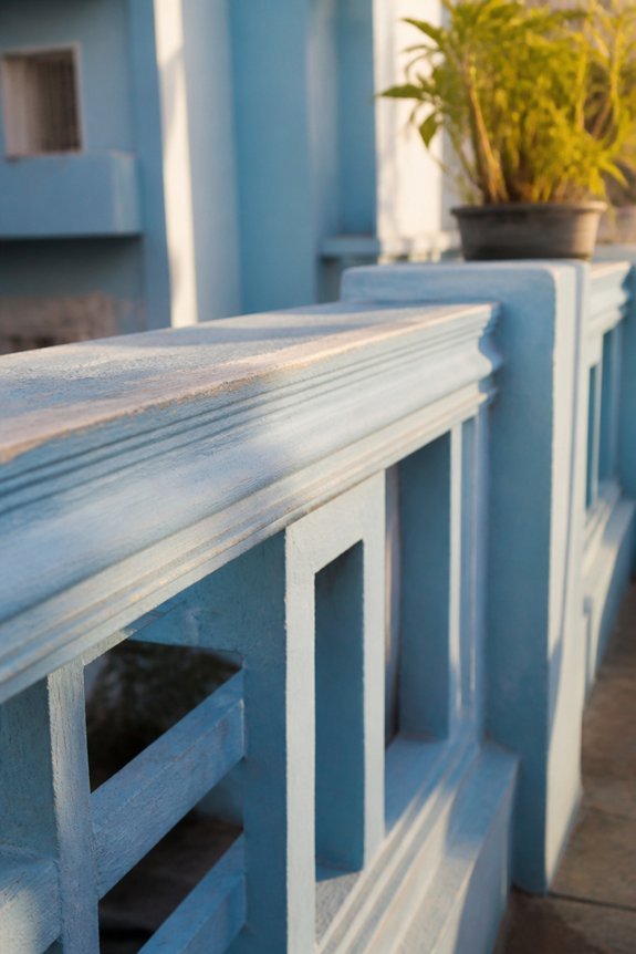
A palette of pale blues creates the illusion of greater depth and openness in confined balcony spaces. Sky blue, periwinkle, and soft seafoam tones visually recede, making small areas appear larger. These colors work effectively on walls, furniture, and accessories.
Pale blues pair well with white trim, natural wood, and neutral textiles. The color reflects light naturally, reducing visual heaviness in compact environments. Plants with blue-tinged foliage, such as dusty miller or blue fescue grass, enhance the cohesive effect.
Applying pale blue to the back wall while keeping adjacent surfaces neutral prevents the space from feeling monotonous. This approach maintains functionality while improving perceived dimensions.
Sage Green for Calming, Natural Vibes
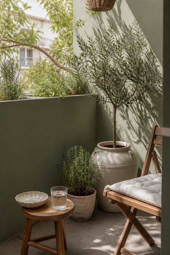
Muted green tones bring a grounded, restful quality to small balconies while maintaining visual openness. Sage green, a soft, grayish-green shade, works well on walls, furniture, or accent pieces without overwhelming compact areas.
This color pairs effectively with natural materials like wood railings, stone planters, and woven textures. Light wood decking or concrete flooring complements sage green surfaces. Plants in complementary containers enhance the natural atmosphere.
The color reflects a calm aesthetic that reduces visual clutter, making the space feel larger. Sage green suits minimalist or contemporary design approaches, functioning as both a dominant color and subtle backdrop depending on application.
Warm Terracotta and Clay Tones
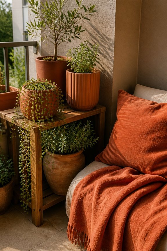
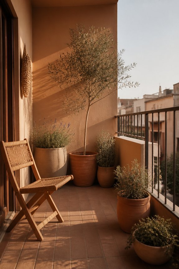
Warm terracotta and clay tones introduce earthy warmth to small balconies, creating spaces that feel inviting without excessive visual intensity. These hues work well on walls, furniture, and decorative elements.
Terracotta pairs effectively with neutral backgrounds, allowing the color to serve as a focal point. Clay tones complement natural materials like wood and stone, enhancing the organic aesthetic. Balconies painted in these shades appear larger through their grounding effect.
Consider using terracotta for accent walls or planters, while reserving lighter clay shades for primary surfaces. This approach maintains visual balance in compact outdoor areas.
Charcoal and Deep Navy for Sophisticated Contrast
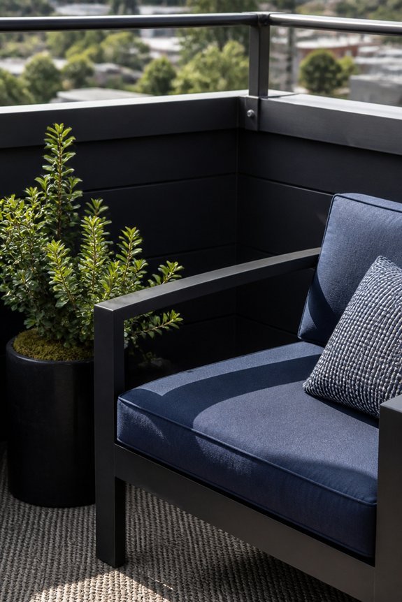
Dark colors like charcoal and deep navy offer a different approach than warm earth tones, bringing sophisticated contrast and visual depth to small balconies. These hues create visual boundaries, making spaces appear larger through contrast effects. Navy railings paired with light gray walls establish clear definition.
Charcoal furniture absorbs light, creating dramatic backdrops for plants or accessories. Deep-colored cushions and textiles add comfort while maintaining elegance. These colors work well with metallic accents like brushed steel or copper. Consider navy painted floors to ground the space visually.
Dark tones suit modern and contemporary styles effectively. Light plants and decor pieces stand out prominently against darker backgrounds.
Blush Pink and Dusty Rose for Subtle Warmth
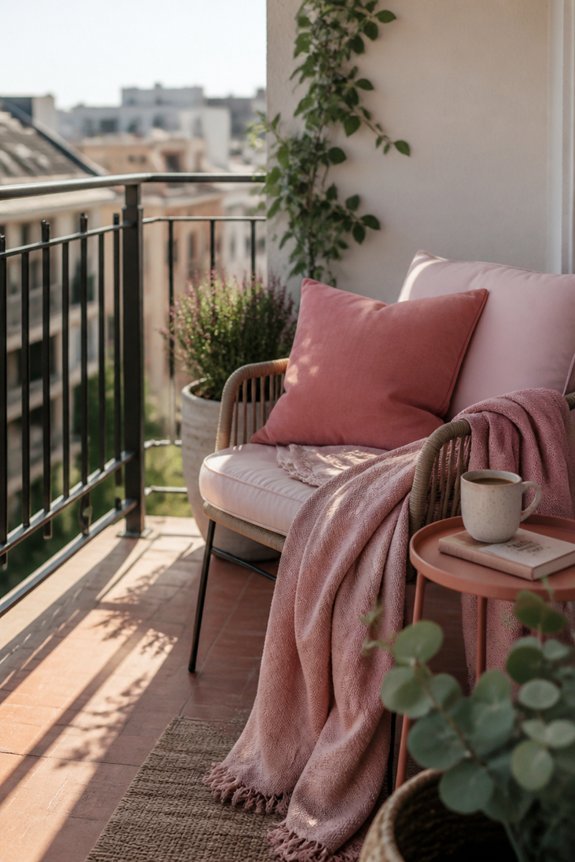
Soft pink palettes offer an alternative to both warm earth tones and deep dark colors, bringing gentle warmth to small balcony spaces without overwhelming the area. Blush pink and dusty rose shades work well on walls, furniture, and accents, creating cohesive designs.
These colors pair effectively with white trim, light gray elements, and natural wood finishes. Potted plants with green foliage contrast nicely against pink backgrounds. Metal railings in brass or rose gold complement the palette.
Textiles including cushions and outdoor rugs in coordinating pink tones enhance visual interest while maintaining a restrained appearance suitable for compact balconies.
Black Accents to Define and Frame
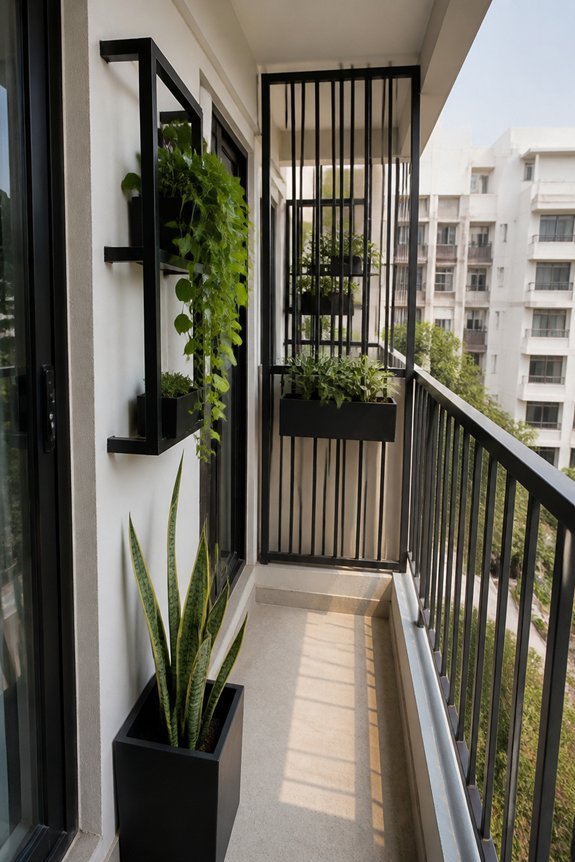
Strategic use of black elements creates visual boundaries and adds definition to small balcony spaces. Black railings, frames, and furniture establish clear edges, making the area appear organized and intentional. Dark painted railings contrast sharply against lighter walls, enhancing perceived depth.
Black planters, cushions, and outdoor rugs anchor the space visually. Metal black fixtures, including light fixtures and brackets, provide structural emphasis. This approach works effectively with neutral, pastel, or bold color schemes.
Black accents require minimal space while delivering maximum visual impact, making them practical for compact balconies requiring structure and sophistication.
Warm Wood Tones to Soften Modern Balconies
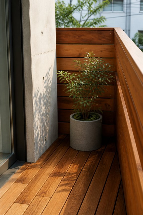
While black accents provide sharp definition and visual structure, warm wood tones offer a complementary approach that softens the modern aesthetic of compact balconies. Natural wood finishes, such as teak or cedar planters, create visual warmth without consuming space. Wood flooring materials, including composite decking, provide comfortable underfoot surfaces while maintaining contemporary appeal.
Wooden railings and furniture pieces introduce organic texture to minimalist designs. These elements work effectively in small balconies because they add depth and richness without visual heaviness. Combining warm wood with neutral walls, concrete surfaces, and metal fixtures produces balanced, cohesive outdoor environments suitable for residential spaces.
Jewel-Toned Emerald for Compact Balconies

Rich emerald green creates visual depth in small balcony spaces, offering an alternative to neutral palettes without overwhelming compact areas. This jewel tone works particularly well on accent walls, railings, or planted containers.
Emerald pairs effectively with brass fixtures, natural wood elements, and white trim. The color absorbs light strategically, making narrow balconies feel larger through contrast. Maintenance involves periodic touch-ups, as weather exposure fades exterior paint gradually.
Homeowners should select high-quality exterior paint formulations designed for balcony conditions. Testing samples on small sections before full application prevents costly mistakes. Emerald green suits both modern and traditional architectural styles effectively.
Soft Yellows and Pale Gold to Brighten Compact Areas
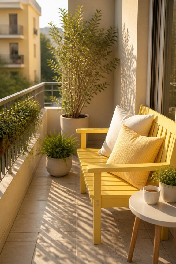
Luminosity becomes a practical advantage in small balcony design, particularly when soft yellows and pale golds serve as the primary color choice. These colors reflect natural light, making compact spaces appear larger and more open.
Pale yellow works well on accent walls or furniture, while soft gold suits railings and trim details. The colors complement neutral backgrounds like white or light gray. Morning sunlight enhances these warm tones throughout the day.
Pale yellows paired with green plants create natural contrast. These hues maintain visual airiness without overwhelming limited square footage, making them functional choices for confined outdoor areas.
Muted Lavender for Personality Without Heaviness
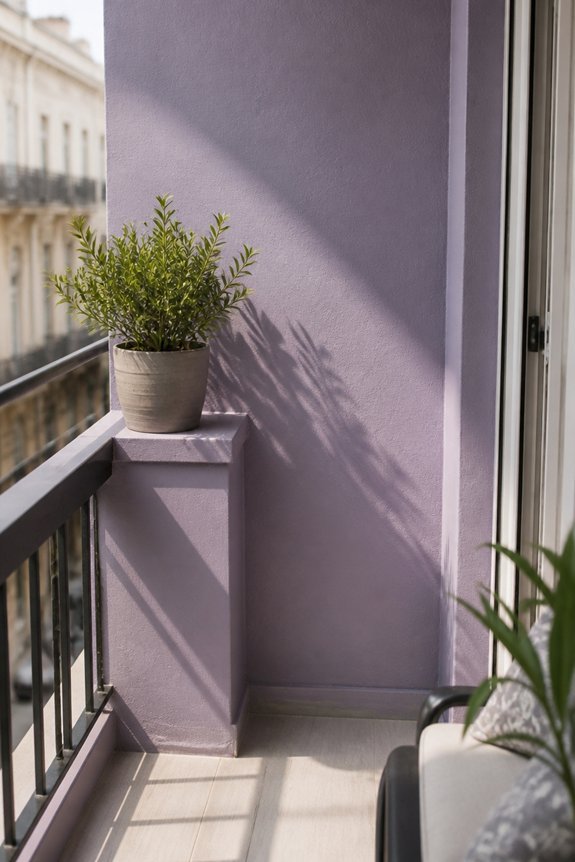
Muted lavender offers a distinct alternative to warm yellows, introducing subtle personality while preserving the open feeling required in compact balconies. This soft purple shade works effectively on accent walls, furniture, or decorative elements without overwhelming limited square footage.
Lavender pairs well with neutral grays, whites, and soft greens, creating balanced color schemes. The hue reflects light gently, preventing the space from feeling cramped or dark. Paint planters, cushions, or a single wall in muted lavender to add visual interest. This approach maintains airiness while establishing a cohesive aesthetic that distinguishes the balcony from surrounding areas.
Warm Beige for Versatile, Timeless Appeal
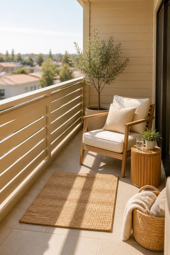
Beige serves as a foundational color choice for small balconies, offering neutral warmth that accommodates various design directions without demanding attention. This versatile hue pairs well with wood furniture, metal accents, and stone elements, making it practical for diverse aesthetic preferences.
Warm beige tones like sandy tan or cream create a cohesive backdrop for plants, textiles, and decorative items. The color reflects natural light effectively, potentially making compact spaces feel more open.
Beige maintains visual consistency across seasons, requiring minimal updates to maintain appeal. Its timeless quality means the balcony remains relevant despite changing design trends.
Deep Plum and Eggplant for Drama in Tight Quarters
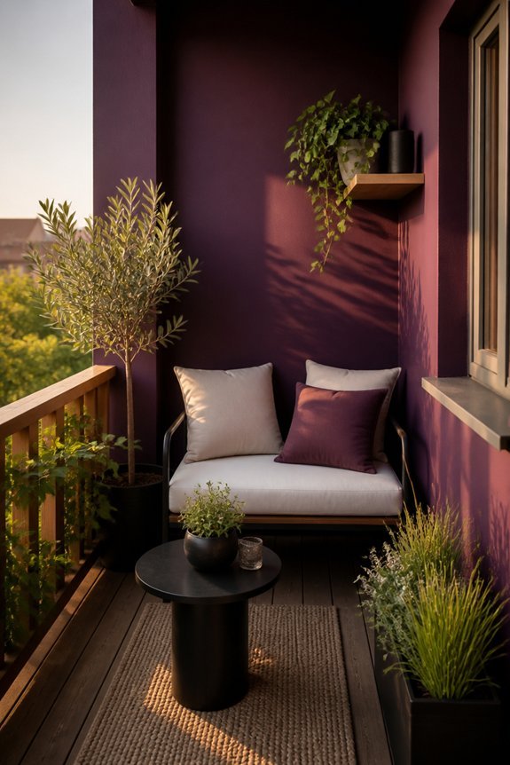
Rich jewel tones offer a practical alternative for small balconies seeking visual impact without expanding the physical space. Deep plum and eggplant colors create visual depth, making confined areas appear larger through sophisticated color layering. These dark purples work effectively on walls, furniture, and accent pieces.
Plum-painted railings or eggplant-toned outdoor cushions establish focal points without clutter. The colors pair well with metallic accents, lighter wood tones, and white trim. These shades absorb light, so adequate lighting remains essential for functionality.
Deep plum particularly suits balconies receiving afternoon sun, while eggplant suits shadier locations. Both colors maintain visual interest throughout seasons and years.
Soft Coral and Peachy Hues for Welcoming Energy

Warmth and approachability characterize soft coral and peachy tones, making them suitable options for small balconies seeking a lighter aesthetic. These hues reflect sunlight effectively, creating an illusion of expanded space.
Coral shades work well on accent walls, railings, or painted furniture pieces. Peachy tones pair successfully with neutral backgrounds like white or beige, preventing visual overcrowding. Plants with green foliage complement warm colors naturally.
Terra cotta pots and warm-toned cushions reinforce the cohesive palette. These colors suit balconies receiving moderate to full sunlight, as they maintain vibrancy without appearing washed out in bright conditions.
Pale Mint Green for Fresh, Airy Feel
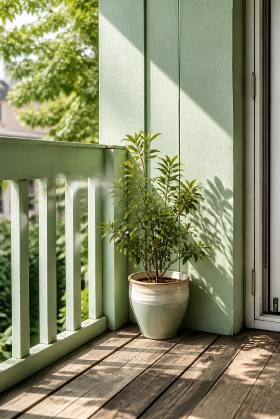
While warm coral tones create welcoming energy, pale mint green offers a different approach by establishing a calm, open atmosphere on compact balconies. This soft color reflects light efficiently, making small spaces appear larger and less confined.
Mint green pairs well with natural materials like wood furniture, rattan chairs, and potted plants. The hue works particularly effectively on balcony walls, railings, or accent pieces. It complements both modern and traditional design styles.
Paint applications should use matte or satin finishes to avoid glare. Pale mint creates visual continuity with surrounding greenery and sky, reducing visual boundaries in tight outdoor areas.
One-Colour Schemes in Multiple Shades for Depth
Monochromatic color schemes use varying intensities of a single hue to create visual interest, preventing small balconies from appearing flat or one-dimensional. This approach involves layering light, medium, and dark versions of one color throughout the space.
For example, pale blue furniture paired with navy cushions and deep indigo planters establishes depth without introducing competing colors. Similarly, gray schemes, combining charcoal, steel, and silver tones, produce sophisticated, cohesive environments.
This technique maximizes visual complexity within confined areas, making balconies feel larger while maintaining organized, intentional aesthetics. The unified palette guarantees that elements work together seamlessly, enhancing overall spatial perception and design coherence.
Two-Tone Colour Combinations for Small Balconies

When moving beyond single-color schemes, two-tone combinations offer increased visual interest while maintaining the simplicity necessary for small outdoor spaces. Pairing complementary colors creates balance without overwhelming compact areas.
Effective combinations include navy blue with white, charcoal gray with cream, or terracotta with sage green. The first color typically dominates larger surfaces like walls or railings, while the secondary color accents smaller elements such as planters, furniture, or trim. This approach prevents visual clutter while establishing clear design structure.
Two-tone schemes also allow flexibility in seasonal updates through moveable furnishings and decorative accessories without permanent changes.
Frequently Asked Questions
How Often Should I Repaint My Balcony to Maintain Color Vibrancy?
One should repaint a balcony every three to five years to maintain color vibrancy. However, frequency depends on climate exposure, paint quality, and weather conditions. High-traffic areas may require repainting sooner for ideal appearance and protection.
Which Balcony Colors Fade Fastest in Direct Sunlight Exposure?
One might believe bright reds and vibrant blues are immortal; they’re not. Direct sunlight devours bold colors fastest, particularly reds, purples, and bright oranges. Darker shades and earth tones resist fading considerably better than their flashy counterparts under relentless UV exposure.
Do Different Paint Finishes Affect How Colors Appear on Balconies?
Yes, paint finishes considerably impact color appearance on balconies. Matte finishes absorb light, creating deeper tones, while glossy finishes reflect light, making colors appear brighter and more vibrant. Satin finishes offer a balanced middle ground, enhancing color richness without excessive shine.
What’s the Best Primer to Use Before Painting Small Balcony Spaces?
Professionals recommend using a bonding primer or rust-inhibiting primer for small balcony spaces. These formulations adhere effectively to various surfaces, prevent moisture penetration, and guarantee superior paint durability in exposed outdoor environments prone to weathering.
How Do Seasonal Weather Changes Impact Balcony Color Choices Long-Term?
Seasonal weather changes greatly affect balcony color durability. UV radiation causes fading, while temperature fluctuations and moisture exposure lead to paint deterioration. Homeowners should select fade-resistant, weatherproof finishes and consider lighter shades for hot climates to maintain aesthetic appeal long-term.
Conclusion
Selecting balcony colors requires balancing light, space, and personal preference. Soft whites, pale blues, and sage greens expand small areas visually. Warm terracotta and coral add character without overwhelming. Monochromatic schemes using multiple shades create depth, while two-tone combinations provide contrast. As the adage goes, “a fresh coat of paint transforms a space”—color choices directly impact how inviting and functional a balcony becomes. Strategic color selection maximizes limited square footage effectively.